Carbon Studio
Johan van Hasseltkade 205B
1031LP Amsterdam
https://www.instagram.com/carbonstudio.eu/
mail@carbon-studio.eu +31 6 22692976 ImprintCarbon Studio
Johan van Hasseltkade 205B
1031LP Amsterdam
https://www.instagram.com/carbonstudio.eu/
mail@carbon-studio.eu +31 6 22692976 ImprintCARBON STUDIO TRIGGERS AUTONOMY
Carbon Studio is an Amsterdam-based strategic spatial design agency, operating from the premise that space should not prescribe behaviour, but enable it. We design freedom.
Triggering autonomy means listening closely to who you are and uncovering what is essential—then carefully translating your identity into powerful spatial experiences that are deeply physical, tactile, and human.
In a world increasingly absorbed by screens, materiality is an essential counterbalance. For us, materiality is not decoration, but a carrier of identity, structure, and intent. Through research and engineering—paired with originality and culturally informed design thinking—we craft environments that enable genuine human interaction and deliver expressive tactile experiences.
Founded in 2017, Carbon Studio is led by Pieter Kool, whose work ranges from large-scale international retail, workplace, and hospitality programmes to bespoke, detail-driven projects. Pieter worked at G-Star RAW from 2004 to 2017, where he later served as Global Creative Director 3D Design & Development and led the design of over 1,000 stores and shop-in-shops worldwide, as well as more than 40,000 m² of office environments and numerous trade-fair pavilions. Pieter also works as a consultant for brands and regularly delivers keynotes on spatial identity, materiality, retail, and workspace design.
Clients
Ace&Tate
Ace Agency
Bugaboo
Barts
Birkenstock
BMW
Bugaboo
Coef Men
Columbia
G-Star RAW
Le Smash Burgers
Nike
OMA - Office for Metropolitan Architecture
Secrid
Scotch & Soda
The Butcher
The Entourage Group
Timboektoe
Toni Loco Pizza
Van Moof
Vitra
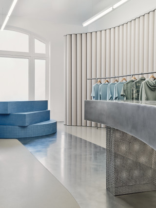
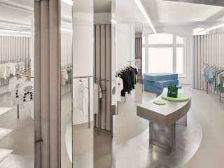
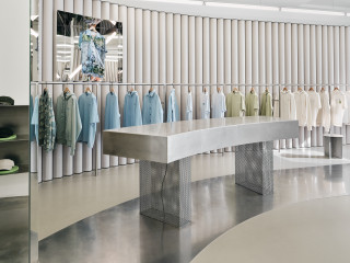
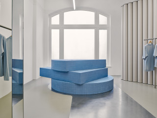
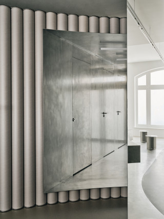


The Olaf Hussein team comprises a group of urban, diverse and friendly people: passionate about streetwear, but valuing genuine connections over bland coolness. The brands latest monobrand concept location is celebration of relationships, both human and environmental, captured in a modular, friendly minimalist aesthetic.
The store is located in two adjacent ground floor spaces of separate historic buildings that have been connected through a small passage. Over time, many alterations have resulted in an odd eight columns scattered throughout the 150m2 space.
The spatial concept embodies a gallery-like experience featuring a continuous horseshoe wall connecting the two spaces. We placed clothing on the inside and outside of the horseshoe and in three places the wall is punctured by two displays or vitrines, and the third puncture connects the horseshoe with the courtyard so natural light comes in from the back. The courtyard is another really nice feature of this space because it helped create a very logical area for fitting rooms – accessible yet private and there’s beautiful light coming in from the courtyard. The blue showpiece at the end of the store is both a window display and a store-facing display and seating element. Each item in the space has been made with a curve to match the radius of the horseshoe. The u-turn shaped trajectory cleverly navigates visitors past the mirror-clad columns.
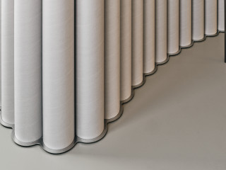
The floor has a brown tone and the cardboard main wall is grey, in order to create a neutral background for the clothing. The economic, flexible and sustainable qualities of the cardboard tubes, combined with the tactile appeal of their round and soft textures, fit well with the ‘friendly minimalist’ ethos that defines the brand.
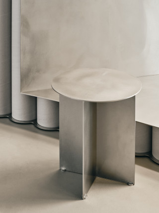
The sustainability strategy for the interior is twofold. Firstly, cardboard is always sourced locally and easily recycled into new cardboard. Consequently, the environmental impact of cardboard is extremely low and it’s truly circular. Secondly, the other fixtures were produced in untreated, low-grade stainless steel. Although the environmental impact during production is high, it’s easy to recycle – not downcycle - and we avoided coatings, paint or other finishes that could contribute to hazardous waste.
photography: Maarten Willemstein
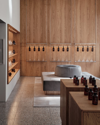

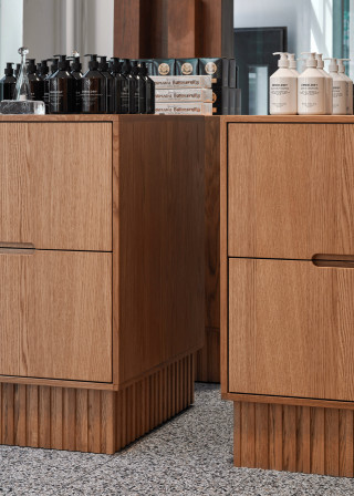
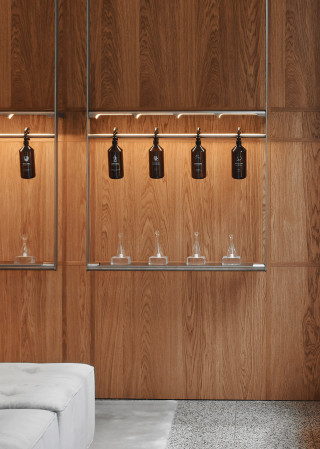

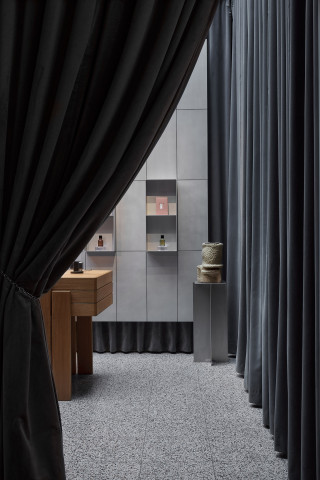
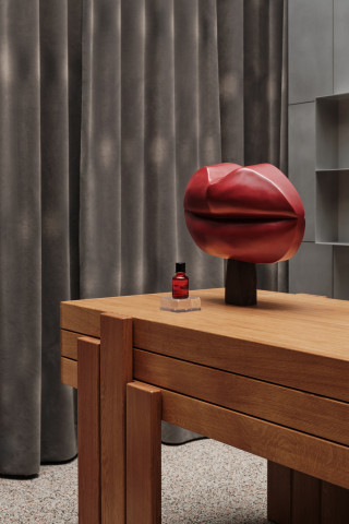
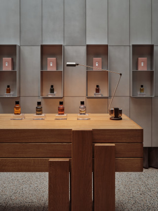
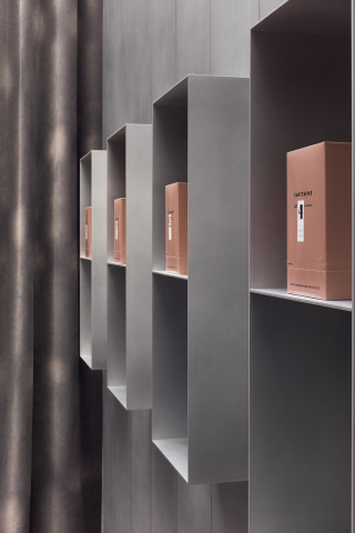
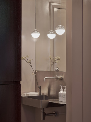
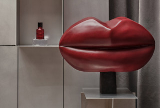
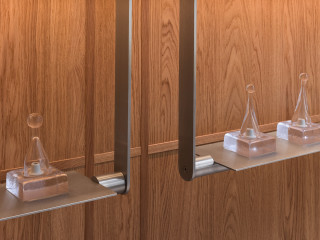
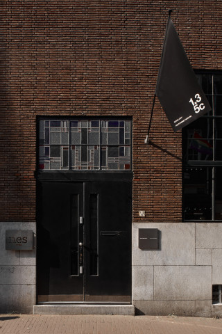
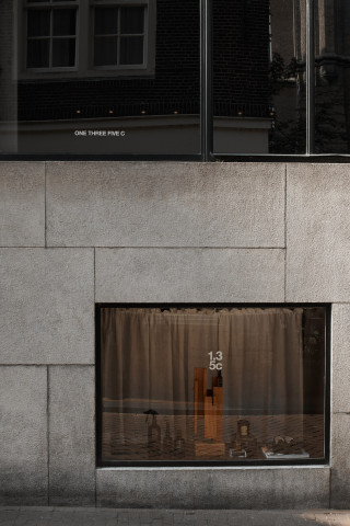
At ONE THREE FIVE C we designed a space where retail, culture, and design merge. The space is located in an early 20th century building in the historical centre of Amsterdam. The interior is designed following the principles of the New Objectivity movement that were leading for the architecture of this site. Inspired by the idea of a hotel lobby leading to a backstage, the layout guides visitors through different atmospheres within one coherent whole. The interior uses architectural clarity, honest, untreated materials materials like glass, oak, aluminium and marble to support the brand narrative. This approach creates not only a store, but also a cultural stage for fragrance and design.
images by:


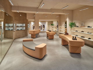
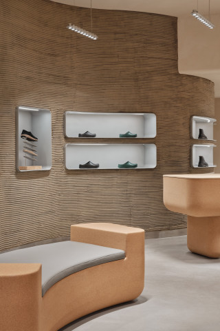
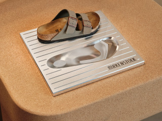

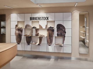
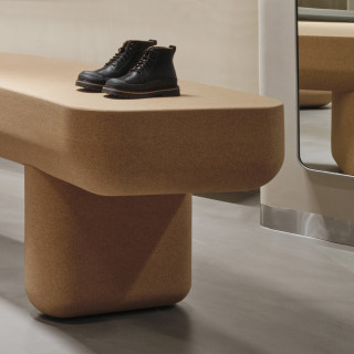
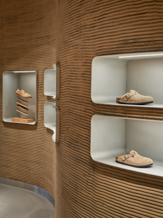
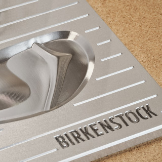
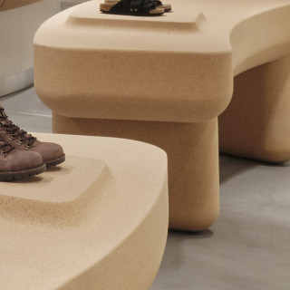
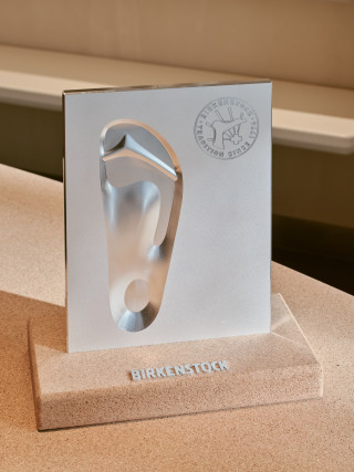
The concept celebrates BIRKENSTOCK’s identity by integrating upcycled cork and leather waste materials, repurposed into bespoke furniture and wall claddings. The brands signature footbed shape was used in blown-up proportions for the stacked window displays.
Drawing inspiration from the rounded forms of the brand’s iconic footwear, we developed a bold and tactile design language that balances warmth and brutalist aesthetics, resulting in a space that feels unmistakably like the brand’s home.
Project in collaboration with ADH Design
Images bij Maarten Willemstein
GC: Golden Sun Society
Interior and furniture: Fiction Factory
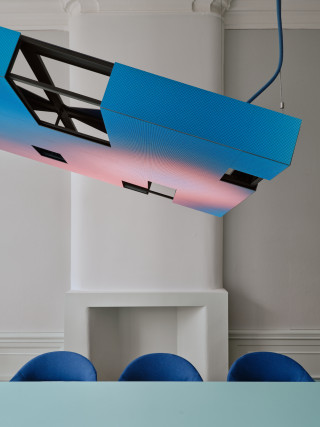
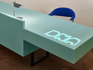
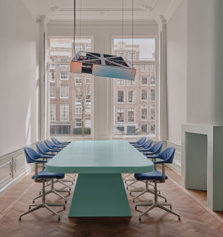
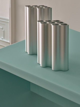

DNA HQ Amsterdam
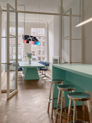
The contemporary office is no longer defined by desks, but by presence—a place for human connection and collaboration.
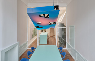
Set within a monumental canal building in Amsterdam, the project is built on contrast: the character of the historic architecture is paired with a precise and carefully controlled contemporary intervention.
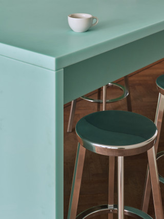
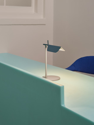
Luxury is approached through reduction. By distilling each element to its essence, material, detail, and proportion are allowed to define the experience. Advanced, technical materials are deployed with a soft outcome—tactile, inviting, and distinctly human.
Technology is integrated as part of the spatial language rather than introduced as a separate layer. Screens function as luminous surfaces, subtly shaping atmosphere, tone, and rhythm throughout the space, supporting comfort and wellbeing.
The result is a workplace defined not by utility, but by clarity, balance, and a refined human sensibility
images: Maarten Willemstein
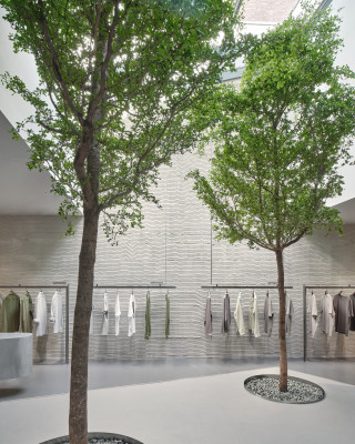
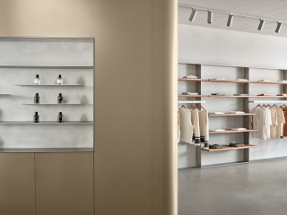
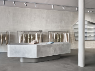
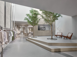
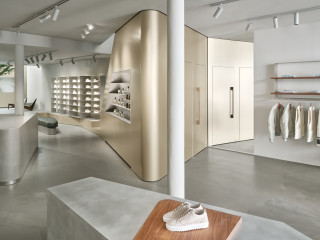

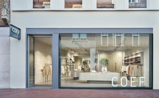
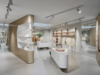

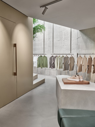
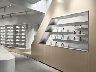
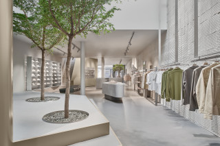
Carbon Studio and KUUB collaborated on the latest store for high-end men’s multibrand Coef in Eindhoven (NL). The 300m2 space is located on a monumental site and the depth of 40 meters is a result of multiple, rather ad-hoc, architectural additions. To bring the site into a single spatial experience and to ensure a captivating journey throughout the space, an interior landscape was created. Changes in floor and ceiling height are utilized, a series of skylights are introduced and halfway the space two 6m high trees were dug into the foundations of the building. Three fin-shaped volumes are introduced to create zones to host the different collections. Each volume houses spacious fitting rooms and other hospitality functions like a coffee bar. Due to the sequence of light conditions and the ever-changing reflections on the aluminium surfaces, the experience of the landscape changes by the minute and with every step you take. The back of the store has a wall-to-wall mirror, accentuating spaciousness and landscape-like qualities of the space. Despite its straightforward 40x8m layout, it's quite effortless to lose track of time and direction while exploring this space.
The minimalist façade allows for a full view inside. The main signage stands on the floor - a nonchalant yet effective placement, as for the passing crowd the sign is more visible than an overhead sign would have been.
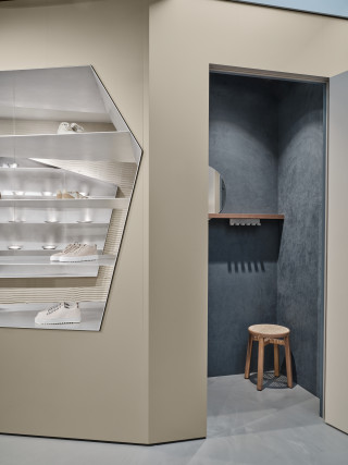
All volumes in the space are designed according to the same rule: made of aluminium, no straight angles and one curved corner. This rule accentuates the monolithic qualities of the volumes, as well as the flow through the space. The fin-shaped high volumes are made of soft, anodized aluminium that changes intensity according to the light qualities and the viewing angle. In contrast, the table monoliths are made of untreated, roughly brushed aluminium. The fitting rooms have an intimate velour wall finish and solid walnut details.
Along the side of the space the hard metals and accentuated angles of the racks and alcoves are contrasted by the rough cement finish of the walls. The horizontal orientation of the cement work adds a nice play with the sunlight coming in from the skylights.
The color palette of the store is in multiple tones or grey and the anodized aluminium volumes have a champaign-like finish. Details like shelves and door handles are in oiled walnut. The other metal surfaces change color according to the conditions around them. Trees in floor and tables were added to the soft color program; all to support the understated and high-end collections in the store. The quality of the experience is rather in the gentle masculine quality of the materials, the material contrast and spatial qualities like flow, shape, sequence and light.
photography Maarten Willemstein
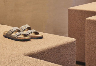
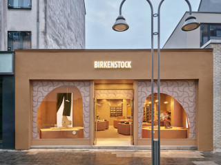
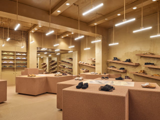
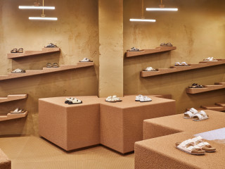
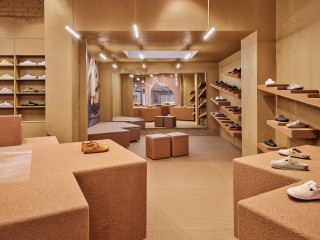
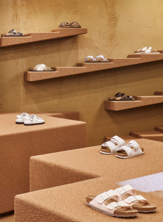
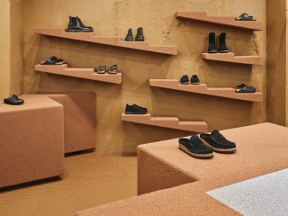
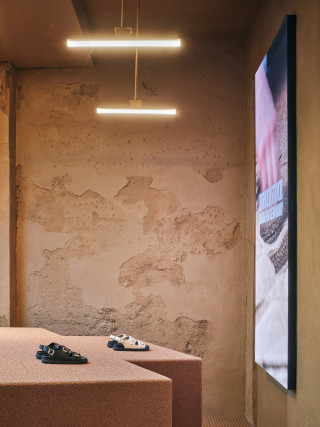
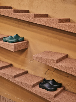
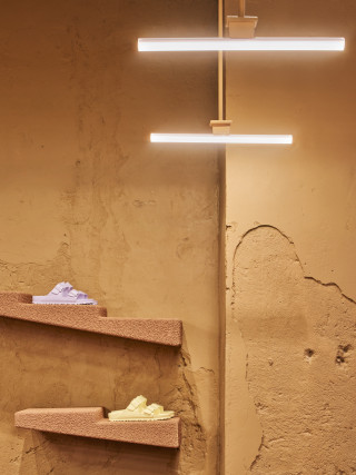
Birkenstock Pop-Up at Ehrenstrasse, Cologne, Germany. The 80-sq-m temporary retail space pays homage to the company’s visual identity through materiality and use of brand iconography; materials like cork and branding details are present throughout. The space is aterialized with native Birkenstock materials only – the stuff they make their shoes with - cork is used for the furniture and the façade. The floor is cladded with Birkenstock rubber outsole sheets.
Modular, cross-shaped display tables – a symbol used for the brand’s original logo – are also made of cork. Reference to brutalist architecture, which first inspired Karl Birkenstock to create functional shoes, is made through angular forms and simple materiality. Rough concrete ceilings and walls are exposed and painted a warm taupe. Staircase-shaped shelving finished in cork provides extra display space. The bone-like pattern of the sole of the shoes is used for the two display windows and floor.
project in collaboration with: ADH Design and The Thirsty Fisherman
photography: Maarten Willemstein
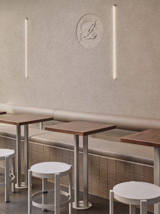


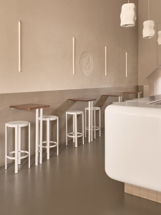
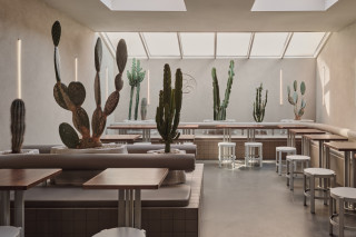
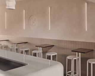
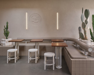
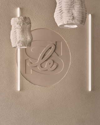
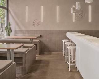
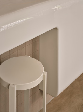
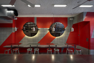
Concept and design for the first three Le Smash locations (Amsterdam, Rotterdam, and Maastricht), translating the brand’s unapologetically direct food culture into a clear and energetic interior language. The design reflects the essence of the smash burger itself: simple, fast, and intensely physical. Honest materials—stainless steel, tile, and robust surfaces—create a straightforward yet distinctive hospitality environment.
The kitchen is positioned as an open stage where grilling, smashing, and assembling burgers become part of the guest experience. A high-gloss curved bar anchors the space and guides circulation, while solid walnut tables introduce warmth and tactility. Custom 3D-printed concrete luminaires and planters—filled with an abundance of cacti—add a sculptural layer throughout the interior. The Le Smash name is literally “smashed” into the walls as stamped imprints, reinforcing the brand’s identity in a playful but physical way.
Together these elements create a bold, stripped-back interior where brand, product, and space operate as one coherent experience.
images: Maarten Willemstein
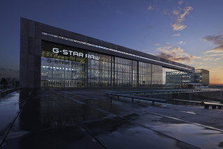


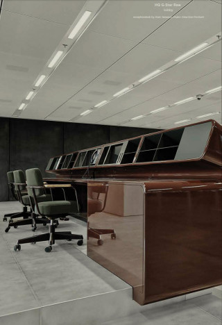
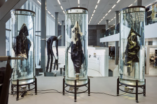
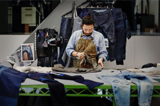
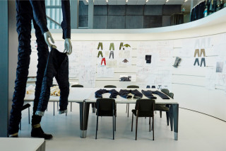
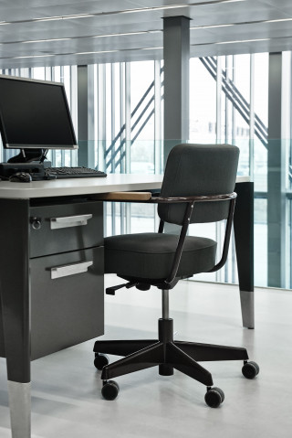
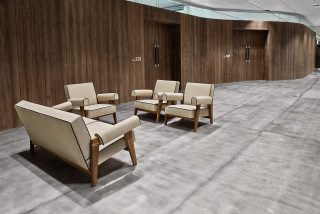

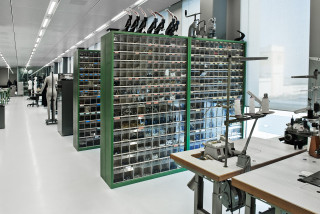
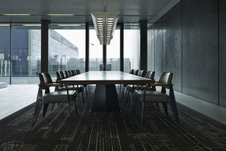
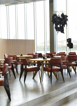
The interior of the G-Star Raw HQ was a classical Total Design project: everything was custom designed into a single integrated interior. ranging from office furniture, wall systems, pantry's, boardrooms, to design studios.
The main theme of the project was maximization of flexibility. Every interior items can quickly be moved and reconfigured to form new design studios, prototype areas, meeting rooms , team areas, etc.
Location: Joan Muyskenweg 39, 1114 AN Amsterdam, NL
Size: 16.000m2 m²
Delivery: Jan 2014
Photography: Lesley Weitjes

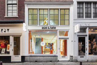
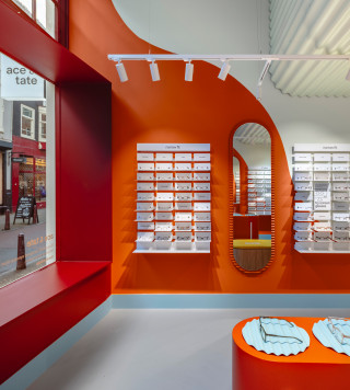
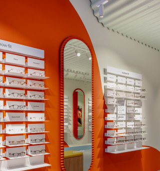

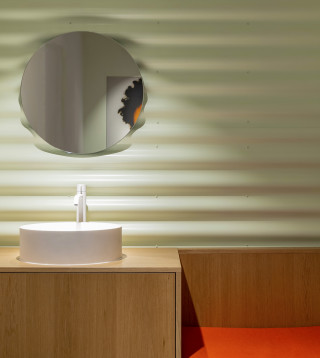
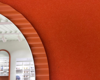
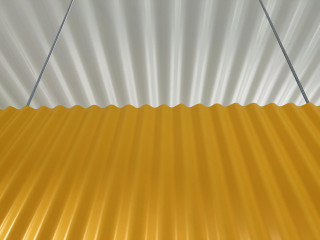
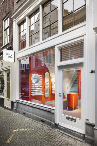
Lined with antique stores and galleries, Nieuwe Spiegelstraat is a swanky street known for top-notch craftsmanship. This inspired us to turn a common, humble material into something as valuable and delicate as a porcelain vase.
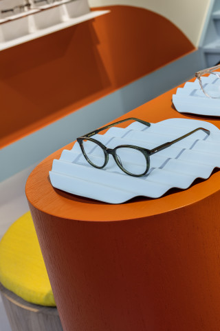
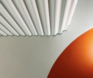
The project briefing was to envision a perspective on sustainable retail design for Ace & Tate. We choose not to look for the usual suspects; hip sustainable materials with an ‘eco look’, but to research industrial processes to find which have a valuable sustainable story to tell. We love it when materials, which are regarded as bland, commonplace or even cheap, are crafted into something of value. For this project we choose wavy sheets of corrugated steel, a very thin yet strong material due to its cleverly engineered shape. These sheets form a design language that’s rooted in post-modernist art and pairs perfectly with the earthy yet vibrant waves on the walls. The metal sheets have a low footprint compared to other materials commonly used as interior claddings and can be easily recycled. Furthermore we researched ways to create a space with circularity in mind. The furniture is made of 100% recycled chipboard, and we used non-toxic glues and low-impact veneer and paints.
Quality is about care, not abundance
images by Wouter van de Sar
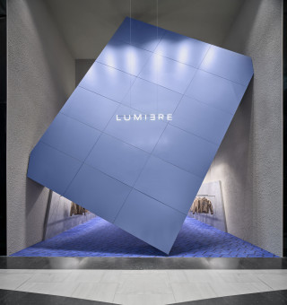
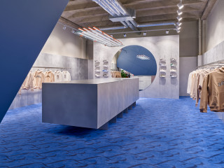
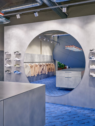
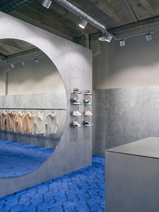
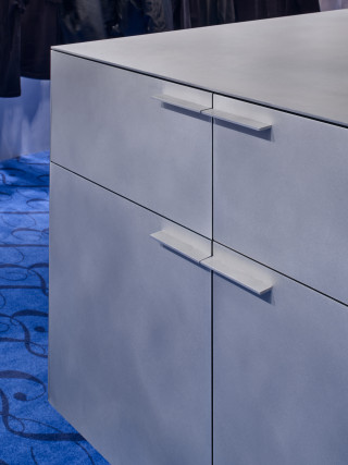

What is an upcoming streetwear brand to do in a hyper-commercial and conformist place? When Lumi3re saw its chance to expand its presence with a 75m2 store in The Hague in a luxury mall, it was the question to actually do it, or not.
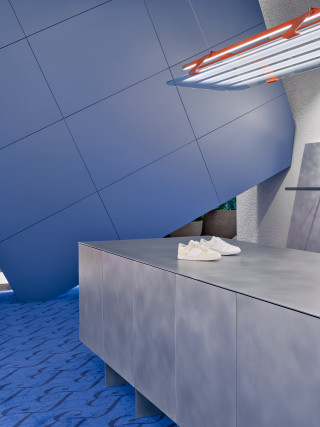
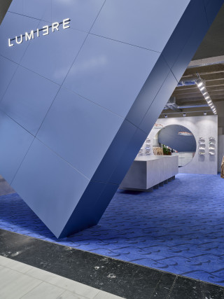
The goal of this project was to bring anarchy into the shopping mall - a bold kind of confidence that is understood by its generation and disregarded by the rest. We choose nót to conform to the rules of frictionlessness that govern shopping mall commercialism. To do so a tilted 7x5x1m volume, blocking the entrance to the store, was created as a Dadaist statement – an ironic comment on commercial conventions.
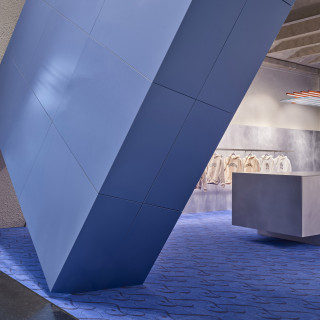
Interesting about the site; the façade front surface is nearly as large as the stores surface. This provided the opportunity to squeeze in a giant obtrusive monolith, tilted in all three directions. The small sized signing amplifies its scale and combined with an anodized skin it becomes a landmark statement. The slanted volume values curiosity over bland convention: passing the skewed entrance is an act of courage. Once inside one is pleasantly isolated from the noise of the shopping mall, as the giant volume forms a visual plus acoustic barrier as where the carpet and sound absorbing rough walls contribute to this aural transformation.
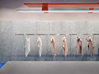
The store with its giant tilted anodized aluminum volume, a heavy aluminum central solid, a large mirror circle and the bright orange light fixture is a composition of monolithic features. The central volume hides multiple functions such as storage and check-out but basically allows for undisturbed personal contact with customers.
The space is cut at eye sight into a heavily textured upper and a refined lower part – the raw top contrasts the clean volumes below, which act as a neutral plinth to display and create focus on the product.
photography: Maarten Willemstein

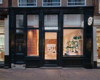
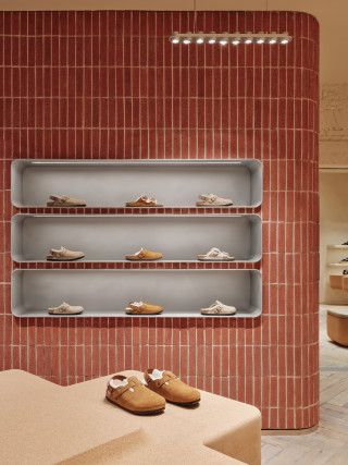
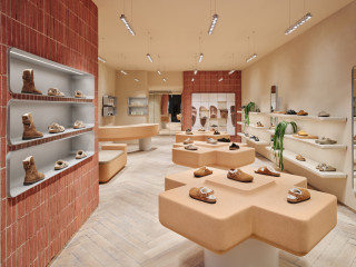
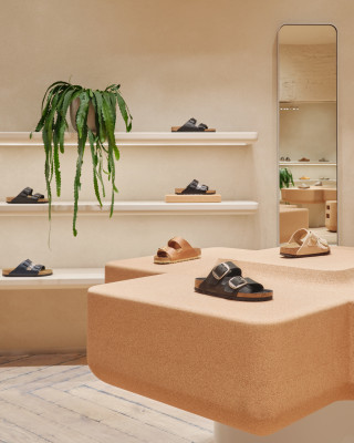
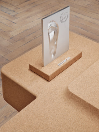
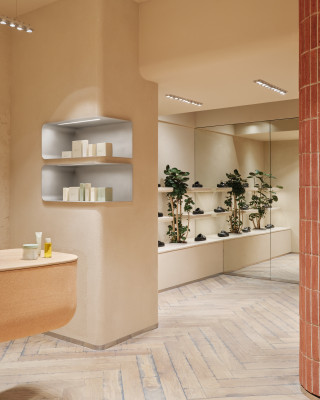
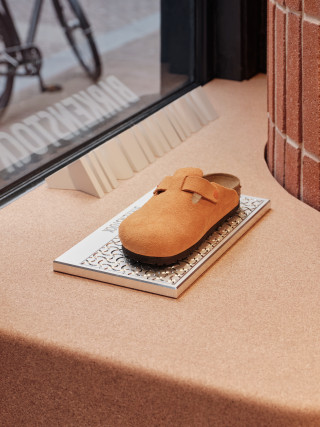
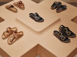
The first BIRKENSTOCK store in the Netherlands. The store incorporates up-cycled cork and recycled stone, reflecting the brands' commitment to sustainability and quality. At the heart of the space are three cross-shaped cork tables, inspired by the iconic three crosses in Amsterdam’s coat of arms. The rounded walls, made of recycled bricks, pay homage to the city’s Amsterdam School architecture, grounding the design in local history and character.
images by Maarten Willemstein
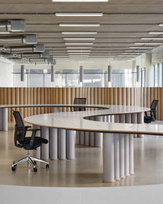
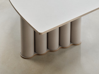
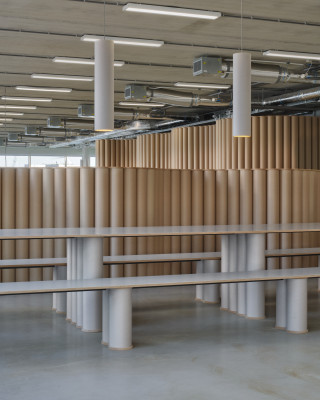
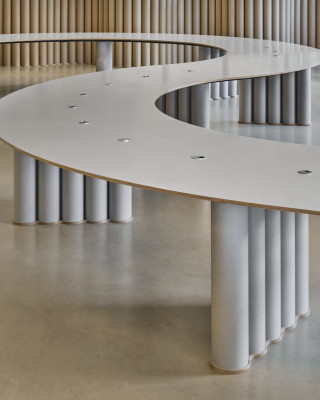
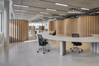
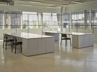
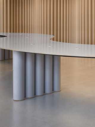
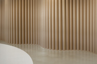
The Olaf Hussein team are a group of urban, diverse and friendly people: passionate about streetwear, but valuing genuine connections over bland coolness. Their pursuit of freedom and togetherness is expressed in the brands’ fresh spatial concept for their headquarters. The interior design draws inspiration from the relationships within the team, emphasizing togetherness, and the brand's commitment to sustainability, resulting in a modular, friendly minimalist aesthetic.
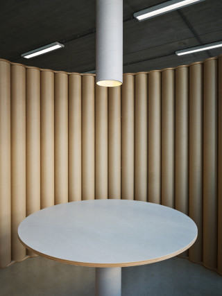
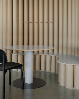
As the Olaf team is young and fast growing, the Headquarters is in a condition of continuous adaptation and reconfiguration to adapt to the changing size and needs of the teams. Consequently we approached the workspace as a set of versatile tools rather than an static interior. We envision the office as a dynamic platform, and we design the rules that allow for effortless change. The primary tools we employ are: cardboard tubes and CNC milled multiplex sheets, which can be assembled into self-supporting structures, creating desks, tables, room dividers, seating, and even walls.
The standout features of the office include a 25-meter-long work table, the wavy room dividers and the impressive 8-meter-long communal table; all designed to encourage togetherness and foster interaction, aligning perfectly with the modern office's objectives. At the Olaf office there are no solitary, dedicated desks: ; instead, the lengthy, curvaceous table accommodates varying occupancies, 5 people can work there – without feeling ‘most desks are empty’ - just as well as 20. We consider this non-binary approach crucial in shaping contemporary workspaces.
Cardboard, a truly circular material, is consistently sourced locally, and discarded cardboard effortlessly transitions into new, recyclable cardboard. The round shape of the tubes inbues them with structural strength while minimizing material usage. When configured in a wavy sequence, the room dividers become self-supporting structures, while remaining lightweight. Consequently, the resulting elements are easy to move around, extend, reconfigure etc. The same principle applies to the supports of the desks, tables, and seating, all designed with the next, yet unknown, update in mind. The economic, flexible and sustainable qualities of the cardboard tubes, combined with the tactile appeal of their round and soft textures, fit well with the ‘friendly minimalist’ ethos that defines the brand.
photography: Maarten Willemstein
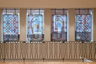
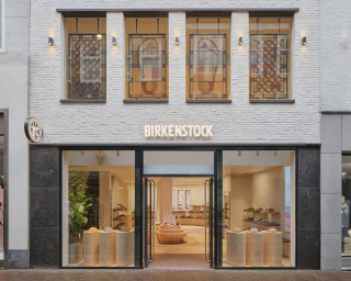
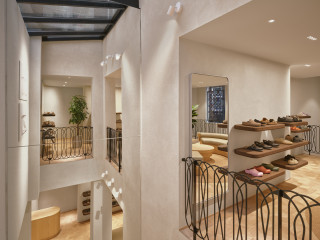
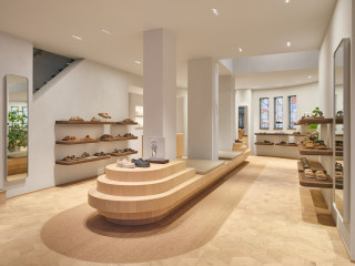
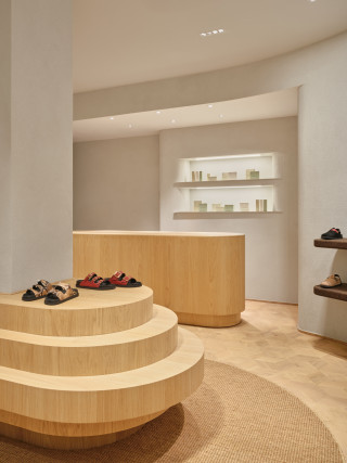


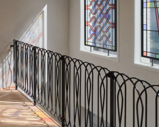
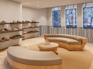
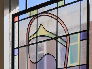
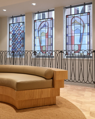
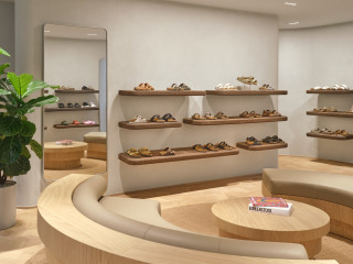

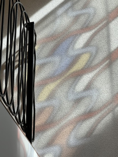
This Birkenstock store brings together the rich architectural heritage of Den Haag with the iconic design language of Birkenstock.
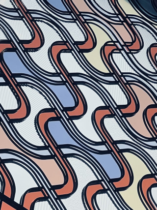
From the rounded forms that echo the brand's signature footwear to footbed-inspired ironworks and stained glass-style graphics, every element draws from both Birkenstock’s DNA and the Art Deco influences that define much of Den Haag’s urban character.
images: Maarten Willemstein

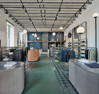







Coef Men Utrecht
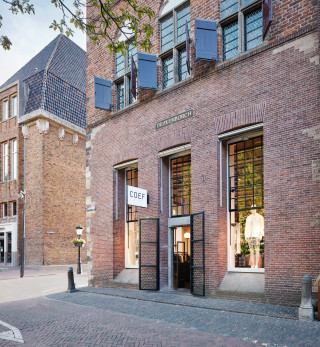
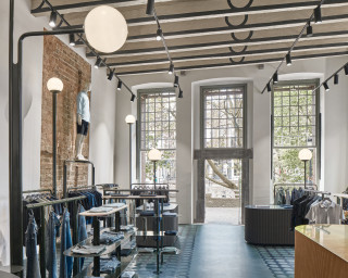
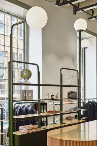
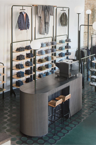
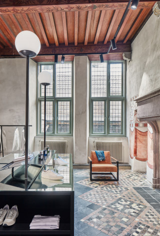
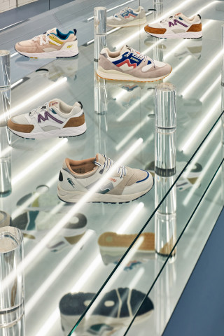
Multibrand store located in the oldest residential building in The Netherlands.
Location: Oudegracht 114, 3511 AW Utrecht, NL
Size: 250m2 m²
Delivery: May 2020
Project collaboration with Kuub Architects
Photography: Maarten Willemstein
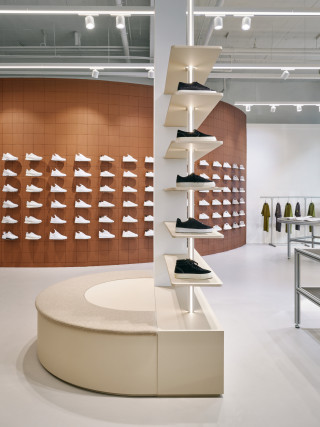
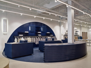
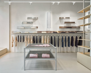


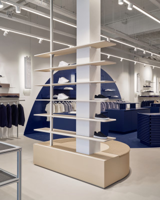
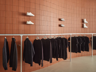

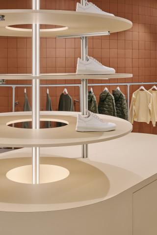
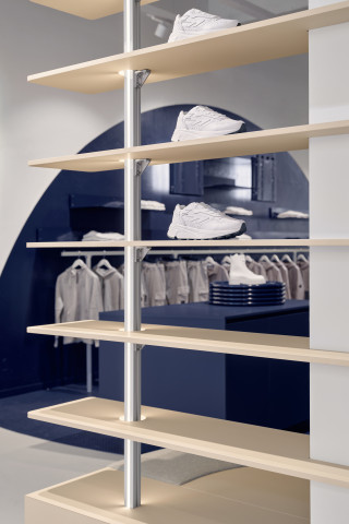
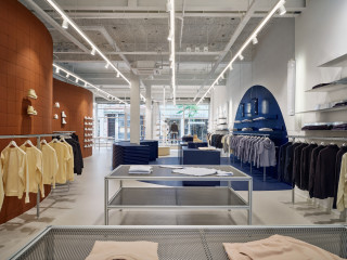
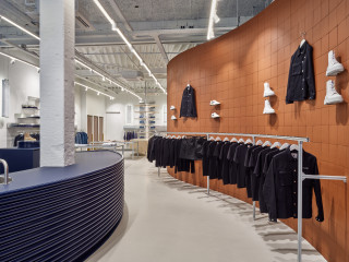
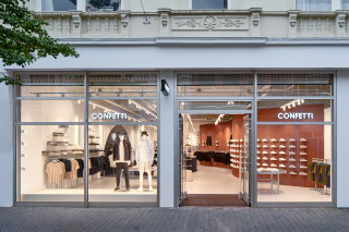
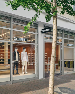
With the first multibrand concept store for Confetti, Carbon Studio created a premium, but personal shopping experience. The store is a hub for the local community and offers an inspirational, rich sensory environment – the essentials for contemporary brick-and-mortar retail. The highly textured space has a modular design, made of a sustainable mix of re-used and easy-to-recycle materials.
Confetti is an upper-mid to premium mens’ multibrand store, a small, 250m2 department store frequented by the local fashionista scene. Because of its’ role in the local scene, hospitality is one of the main drivers for the design of the store. The owners run the store themselves, curate the collection and host on-site events. Hence, a well-equipped bar is positioned centrally in the space and serves as a hub for social encounters and personal service.
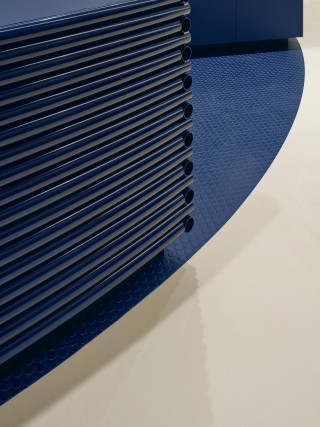
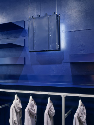
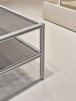
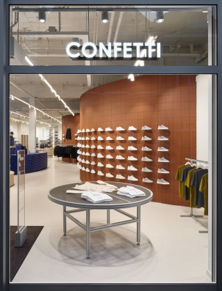
The spatial setup is a sequence of neutrally toned gallery areas and two large interventions - the curved terracotta wall and the blue zone – both with an amplified materiality and use of colour. The gallery areas are a toolbox of modular aluminium profiles and perforated sheets – easy to reconfigure. Additionally two high modular shelving units with vertical lighting are added to the gallery set
Over the years, the building had become a patchwork of several extensions and restorations. Especially the right side of the space is a clutter of walls, columns, staircases, etc. Now, a terracotta wall smoothly winds itself around the chaos and organizes the flow into the store.
Round shapes, ranging in scale from architecture to furniture details, create a soft flow through the store and balance the bare, highly textured materiality of the space.
Recycled and locally sourced materials are dominant in the design. For example, the wall-facing luminaires are recycled from suspended office ceilings and locally recycled, low-grade aluminium is used for the shelving. The curved wall is cladded with leftover lots of terracotta floor tiles - with the back side facing forward to hide mismatches, but also to amplify the textural qualities of the material. When new materials are used, they’re designed for reconfiguration to extend their life-cycle, and for easy separation to ensure after-life recycling.
photography: Maarten Willemstein
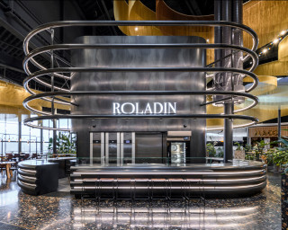
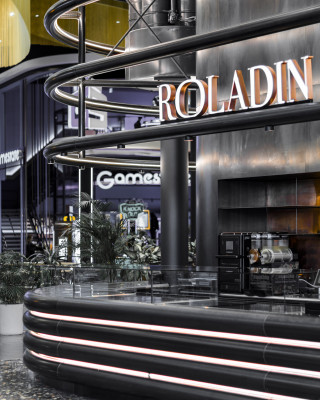
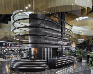
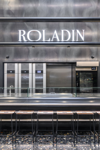
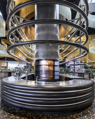
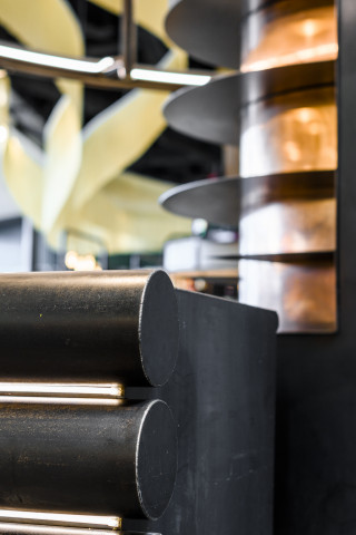
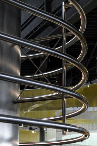
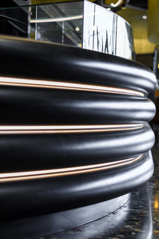
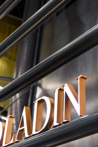
The Roladin bar at the Mall of the Netherlands is the central showpiece of the main food court. The size of the space (4000+ m2) in combination with the elaborate, high-end mall architecture, required a large, bold design to mark the central bar. The object has a total bar length of 25m and with a height of 6m. The bar changes its’ function during the day. During shopping hours, fresh pastry and cakes are baked on the spot and are served together with coffee and juices. At night the crowd changes to visitors of the surrounding restaurants and cinemas and the bar adjusts accordingly; savory bites are baked and a full offer of beers can be served, as well as cocktails from the cocktail station.
Being located in the middle of the food court, the bar needed to be accessible all around and have a 360 degree visual impact; hence the symmetrical pill shape. Not only functionally, the program was strikingly similar to that of American drive-inn restaurants, also conceptually we see similarities. This lead to the aesthetic design theme, referring to the art-deco glamour of post-war Miami Beach, perhaps with a bit of Fritz Lang’s Metropolis mixed into it. These references purposefully add a sense of irony to the project, as seventy years later, it questions the naivety of the once-so-true consumerist dream that modern shopping malls still project on us.
The monolithic design juxtaposes the polished, visually extravagant design of the food court interior. The entire structure is made of hot-rolled steel: the steel sheets of the core have been carefully selected for their patina and the outer layer of 20cm round tubes have been industrially machined into their curve. The structure has been preserved with a natural oil, nothing else.
Although the structure is made to last a lifetime, the mono-material approach, without the use of any chemical coatings, is the sustainable strength of the project: the material can easily be brought back into cycle after the bar is dismantled, without any treatments and wasting leftover materials. To the hot-rolled steel structure, only a stainless steel counter top and brass details were added, each of them easy to separate from the steel base. The concept is to preserve the pure material - rather than to wear it down - and to leave no trace behind in the form of waste or downcycled materials.
photography: Sophia Cipriano @ prjctwrks
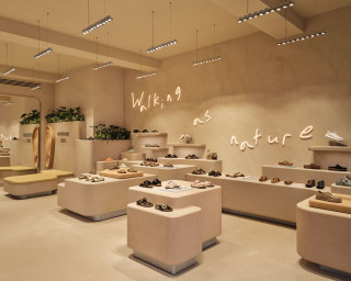
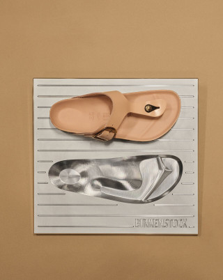
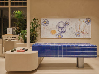
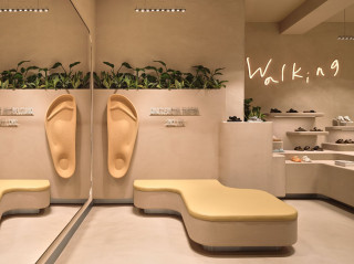
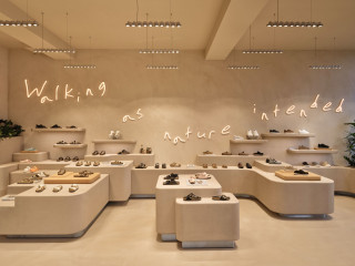
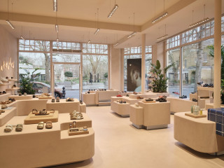
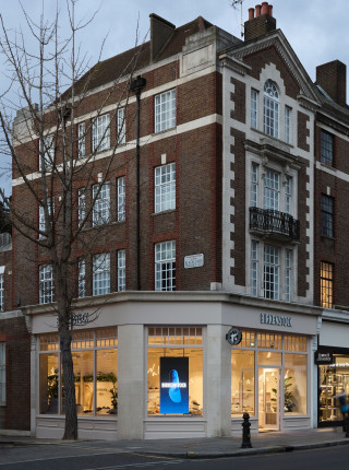
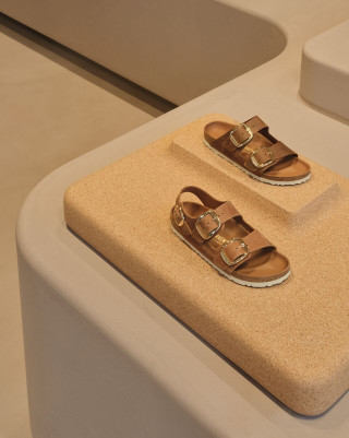
King’s Road in Chelsea has been a hub for creativity, culture, and style since the 1960’s—making it the perfect home for BIRKENSTOCK’s London Chelsea store.
The store’s design reflects Chelsea’s character, blending historical and modern influences. Natural materials like cork and leather—core elements of our iconic footbed—reinforce our commitment to quality, while earthy tones and minimalist forms create a welcoming atmosphere.
project in collaboration with ADH Design
images by Maarten Willemstein
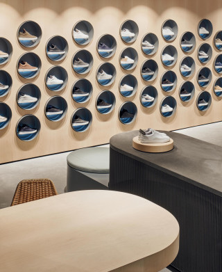

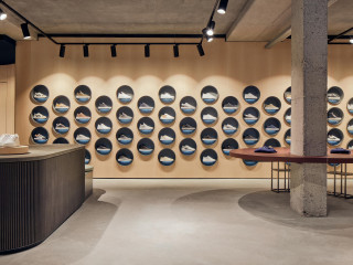
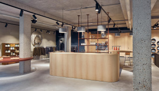
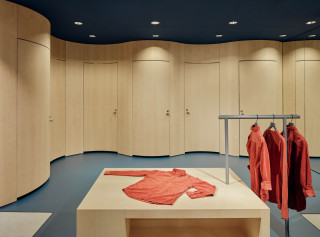

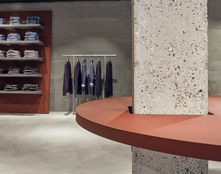
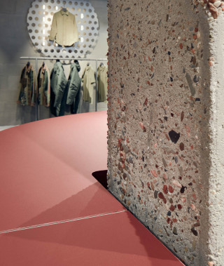
A pleasant men’s department store for premium multi brand Coef Men.
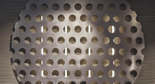
In contrast with the brutalist concrete hull, refined circular elements are introduced, resulting in a clear-cut interior with a balanced atmosphere.
Building:
The store has a façade of twenty meter wide, at the Haarlemmerstraat in Leiden, and is embedded in a street full of small ornamented shop facades. Nine concrete columns dominate the square 400m2 concrete hull.
Concept:
Physical shopping should be a rich physical experience in which your senses are activated.
• Coef men is a curated men’s department store centred around personal attention and quality service. A welcoming gesture is made with the wide space around bar, cash desk, seating elements and fitting area. Lavish material use quality and carefully designed and executed details further set the atmosphere for the high level of service.
• Maximum contrast between the rough, cold, and orthogonal concrete hull and the warm, refined, circular interior elements intensify the shopping experience.
Facade:
The twenty meter wide facade consists of glass alone, turning the store into a display case. In every window segment another department of the store can be viewed.
Interior:
Contrast has been sought not only with the sober concrete hull, but also in luxury levels of furniture elements. The premium collection needs no more than a modest socle, but the zones for people have been lavishly materialized.
An undulating twenty-five meter long maple wooden wall passes through the concrete hull that was stripped to its constructive essence. The wall starts as sneaker wall with 75 illuminated alcoves integrated. It flows into the fitting area, which is the most warm and intimate zone of the store. The undulating wall with integrated doors separates the public and private parts of the fitting zone.
A flexible and minimalistic furniture system is developed for the integration of mirrors, seats and accessory presentations. The concrete columns carry the large round presentation plateaus as if they are trays
.
Result:
With this project Carbon Studio and KUUB aim for a shop interior that celebrates physical shopping as a personal, social, tactile immersive experience. They utilize the benefits of the store location and quality of the existing structure in a design strategy with real materials and a flexible building system. Resulting in a comfortable shopping experience with clear-cut architecture
photography: Maarten Willemstein
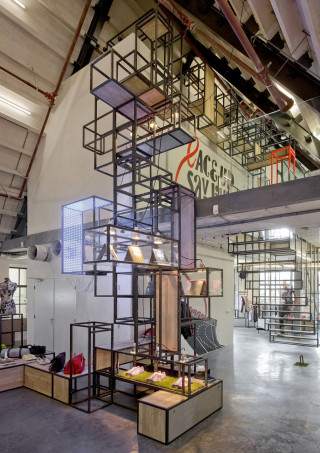

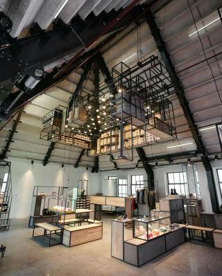
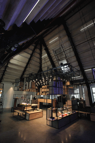
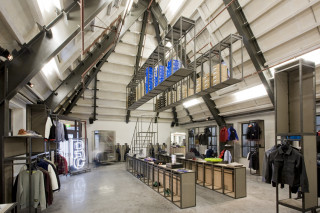
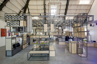

The Precinct 5 project defines the Carbon Studio design philosophy. Design should be an approach that reflects the tendencies of our contemporary society - under the influence of the media and rapid technological developments, our world, our lives and the way we interact with each other are increasingly characterized by speed and in a state of constant flux. Creating an intelligent system that allows for change and adaptation is the core of the Precinct5 project.
The client was the owner of the Patta sneaker store in Amsterdam, aiming to extend their reach into men fashion. The brief for this project was “create a squat-chic multifunctional space with retail at its core. Oh, and the budget is next to nothing”.
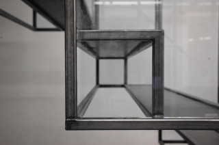
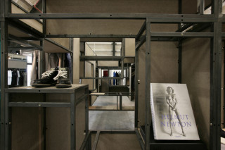
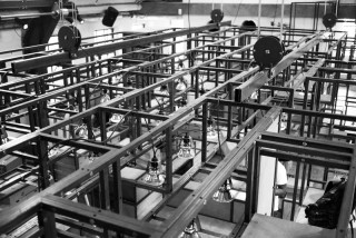
The former police station was stripped to the constructional core and an anthracite concrete floor was added. Electrical pullies were installed on ceiling beams as well as a grid of connective joints on walls and floors. The grid is based on the 4 elementary functional needs of retail: 21cm for stairs, 42cm for seating, 84cm for counters and 126cm for hanging clothing. Interior elements are the 130 modular, 3D connective frames form the building blocks for the space. Additional functionalities like mirrors, fitting rooms,, stairs and signage were all placed on wheels. The conditions for an evolutionary fixture playground were set, producing formations rather than forms.
Location: Singel 459, 1012 WP Amsterdam, NL
Project: Retail. Concept, Design, Execution
Size: 350m2 m²
Project collaboration with Kuub Architects
Photography: Marcel van der Burg
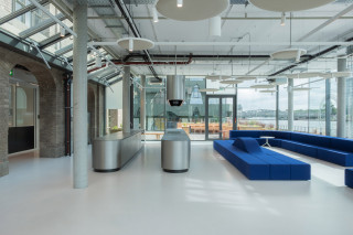
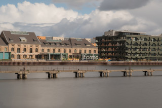
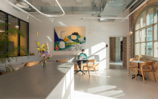

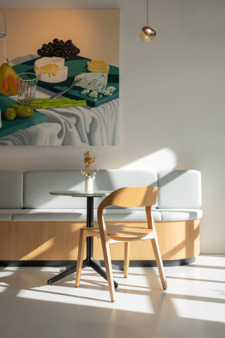
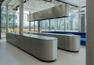
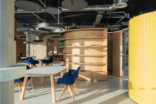
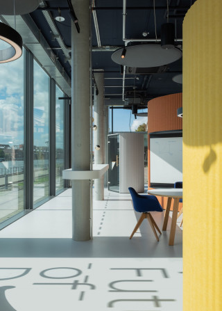
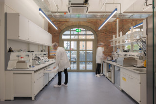
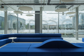
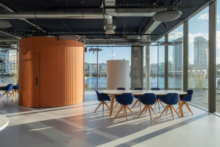
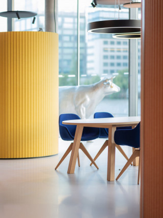
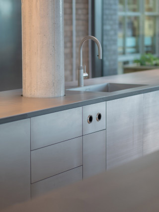
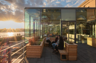
Formo is a scale-up, specializing in lab-made cheese: real cheese, but without cows. In their Berlin HQ workspace and laboratory are combined in a 700m2 site along the Spree river.
A cafe forms the entrance to the building, leading to the labs and 'future of food kitchen lab', as well as the workspace areas.
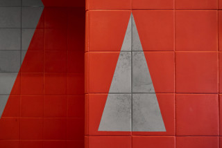
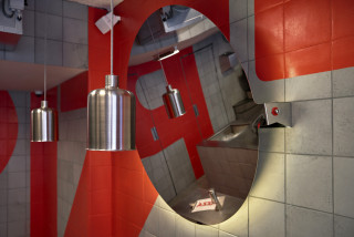
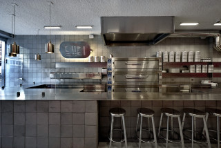
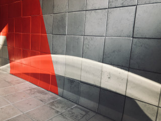
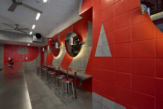
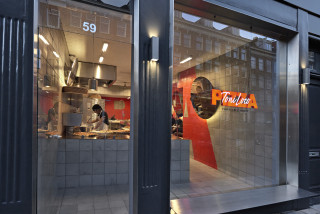
Toni Loco Pizza
Locations:
Delivery: Oct 2018, March 2019
Photography: Lesley Weitjes
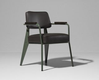
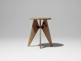
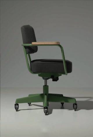

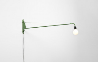
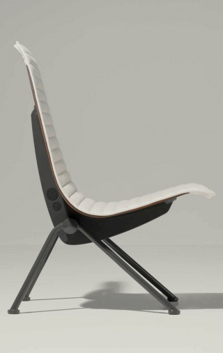
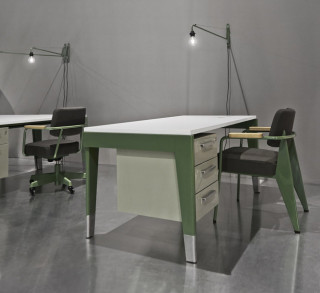

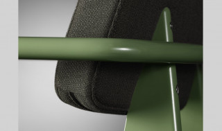
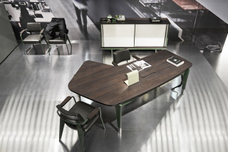
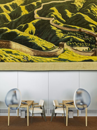
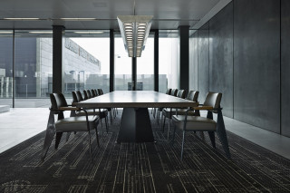
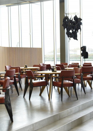
Office furniture series and Home furniture series, based on designs by modernist designer Jean Prouvé.
Reissues of a selection of furniture and lighting that was originally designed for offices of French industrial companies by Jean Prouvé in the 1940s. Some items have never been produced before. Working with the designer’s family and Vitra, all pieces in the collection were reinterpreted to work in today’s modern offices, including accounting for increased human height, modern production methods, EU certifications and functional elements like height adjustability and e.g. cable management. Prouvé RAW Office Edition and the Prouvé RAW Home Editions are made up of 23 pieces that stay true to Prouvé’s designs while bringing them into modern times.
project: Vitra Prouvé RAW by G-Star
Delivery: June 2015
Collaborators: Vitra & G-Star design team
Photography: a.o. Lesley Weitjes
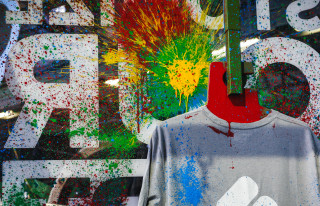
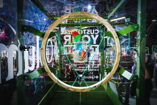

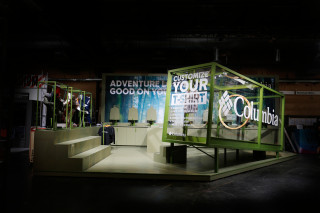
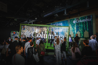
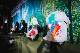
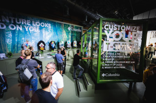
Columbia customization event - the fun of violence.
Columbia has a strong reputation in outdoor performance wear and is very credible in this market. For the Zalando Bread & Butter Berlin B2C Event, the brand expanded its reach to the world of lifestyle as well, which brought exposure to a new audience.
The Zalando BBB was a great platform to reach a lifestyle savvy audience in Europe. With the recent resurgence of sportswear and outdoor in the fashion world, it allowed for a natural bridge to tell the rich stories and innovation of Columbia, but with a fresh modern twist.
We were briefed to come up with a brand activation that could create PR buzz for Columbia in this event. The idea had to be smart, create impact and spread-ability for a relatively humble budget. From past experiences, we knew that most brands had bigger investments with larger stands and spectacular digital experiences. So we were looking to do the opposite.
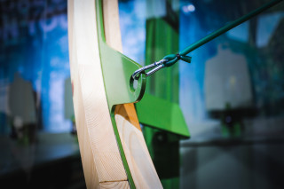
When everyone in the fair went digital, we chose to go analogue. We felt that there was something irresistible about creating a stand that people could have a hands-on visceral experience. Like going to a fun fair, no one could resist a paintball shooting range Inspired by that idea, we created and carefully engineered a fully functional catapult system that allowed participants to customize t-shirts through shooting paint.
During the fair, sure enough, it attracted a lot of attention and people started queuing up to join. Equipped with multiple GoPros attached in the shooting cage, we were able to share the experience through various social channels.
Client: Columbia
Location: Bread&Butter, Berlin, GER
project: Activation at Zalando Bread&Butter Expo. Identity, Concept, Design, Engineering
Size: 80m2 m²
Delivery: Sept 2018
Collaborators: Superlarge
Photography: Lesley Weitjes
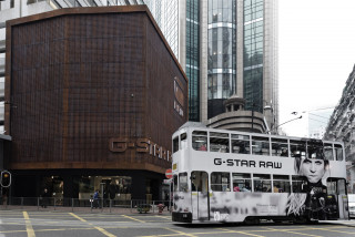
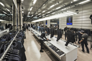

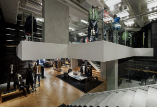
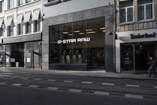
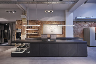
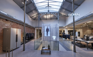
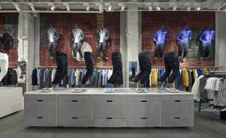

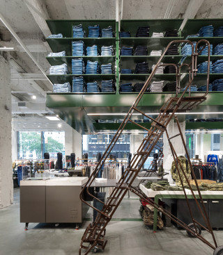
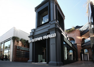
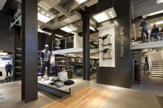
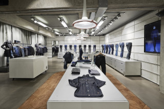

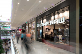
Concept, design engineering of global flagships stores for G-Star Raw
Locations: London, NY, Tokyo, Hong Kong, Shanghai, LA, Paris, Amsterdam, Antwerp, Barcelona, a.o.
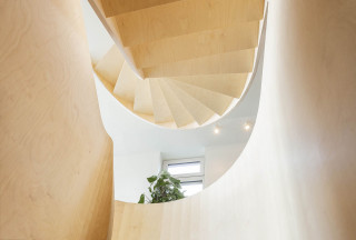
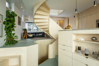
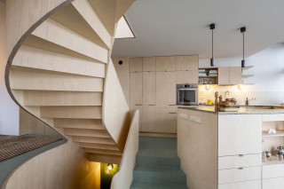
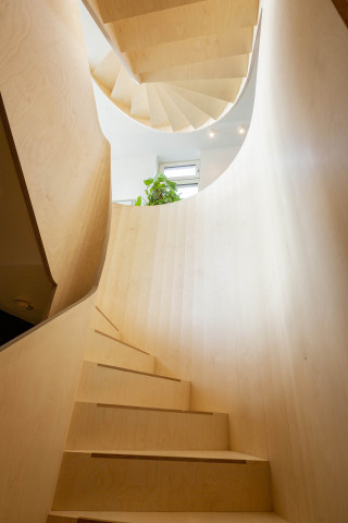
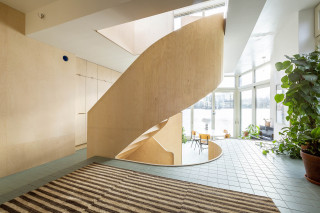
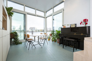
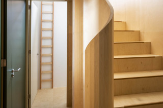
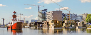
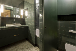
Private interior for houseboat in Amsterdam. The boat is one of the most energy efficient homes in NL and is part of the sustainable SchoonSchip project in Amsterdam. The most striking element is the spiraling staircase, which organizes the functional zones within the house. The stairs are constructed from Russian birch multiplex. The multiplex was CNC milled and constructed and later craned into the houseboat on site.
Location: Schoonschip Amsterdam, NL
Size: 180m2 m²
Delivery: Jan 2020
Collaborators: John Kusters Architect
Photography: Arjan van de Vegt & Studio Muk

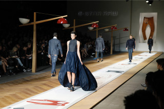
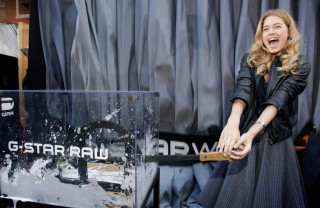
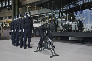
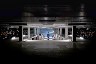
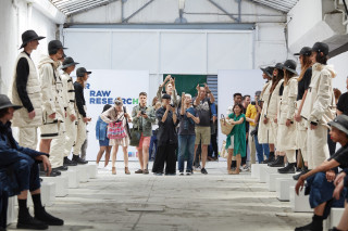
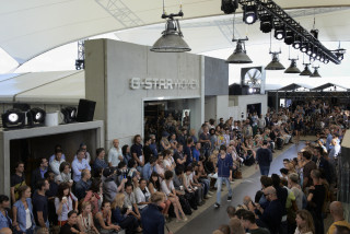
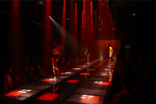
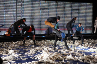
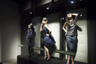
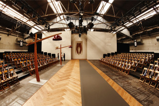
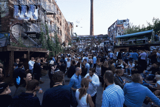
concept, design and interior props for G-Star Raw fashion shows and events.
locations: Berlin, NY, Amsterdam, Barcelona, Paris
collaborators: G-Star design team
photography: Lesley Weitjes
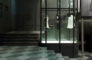
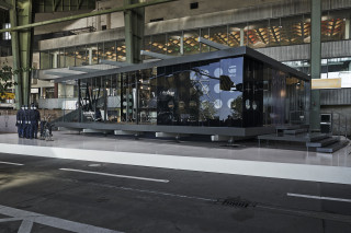
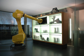

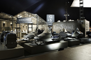

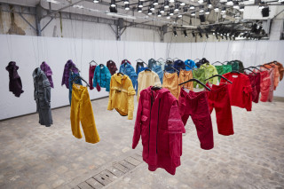

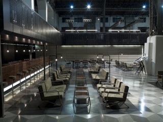
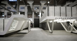
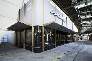
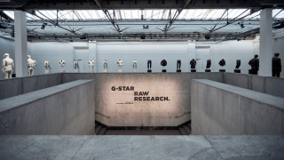
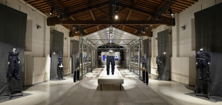
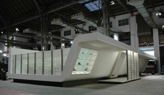
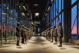

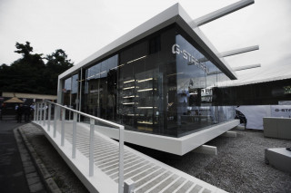
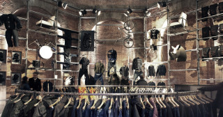
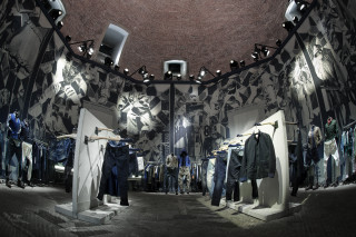
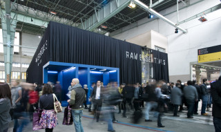
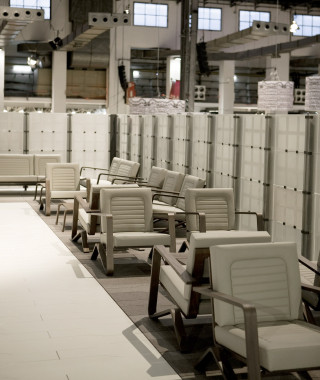
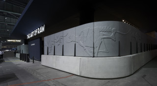
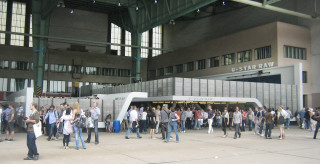
Concept, design, excecution of global trade fairs.
Locations: Bread&Butter Berlin, Coterie NY, Pitti Florence, Who's Next Paris, CIF Copenhagen, CHIC Shanghai, Project NY, Tokyo Design Week, etc
Size: ranging form 50 to 2500m2
Photography: Lesley Weitjes, Max Sabander, e.a.
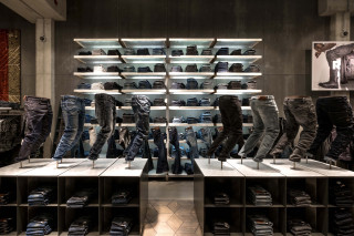
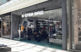
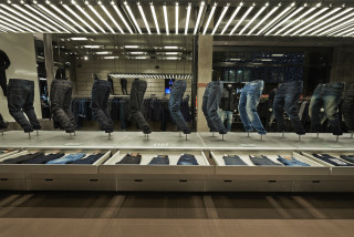

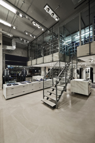
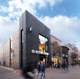
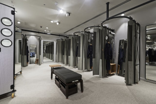
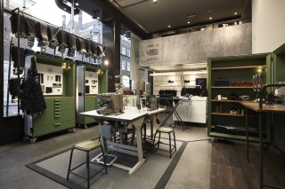
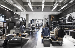
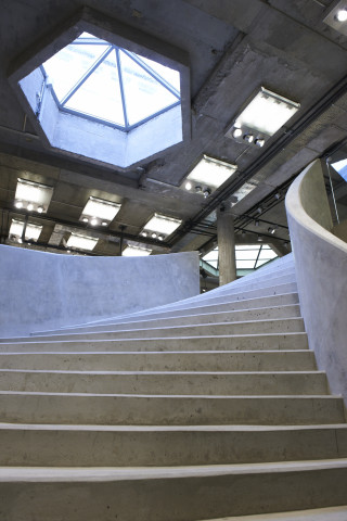
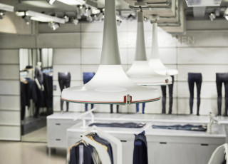
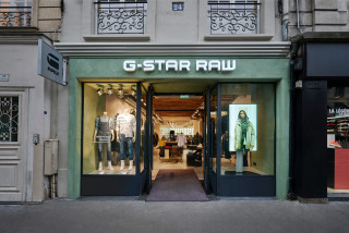
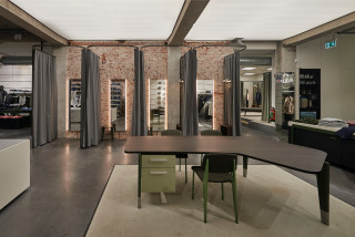
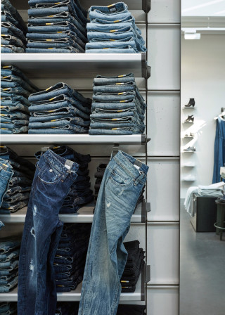
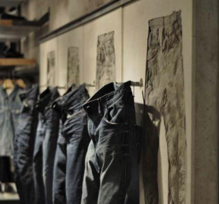
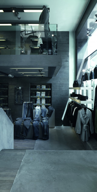
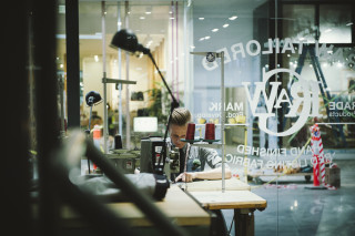
concept, design, engineering of 3 generations retail concepts. furniture portfolio management.
400+ monobrand locations worldwide
1500+ brand corners worldwide
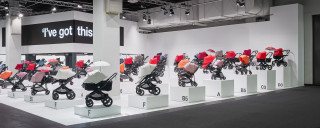
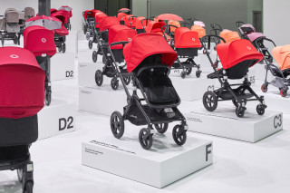
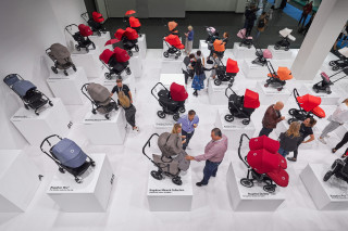
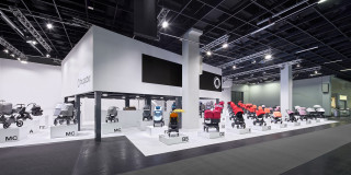
Location: Kind&Jugend Fair, Cologne, GER
Size: 350m2 m²
Delivery: September 2019
Project collaboration with Kuub Architects
Photography: Philip Kistner


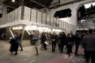


we are triggered by content, not by size
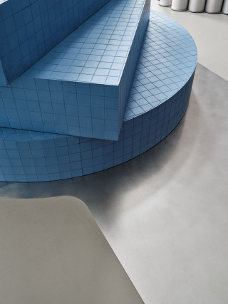
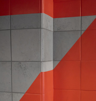
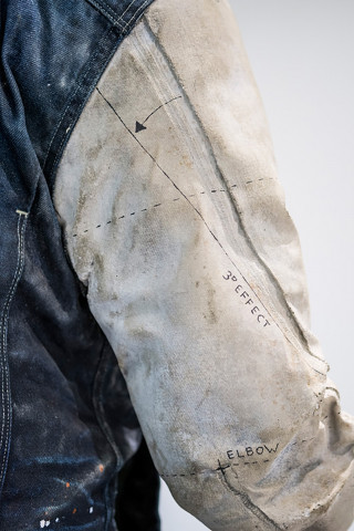
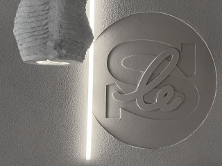
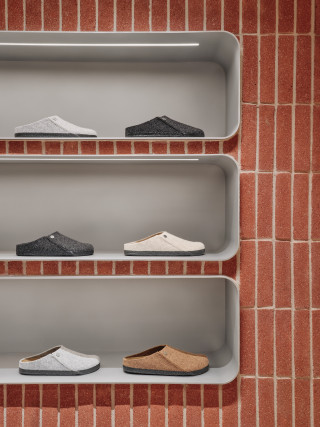
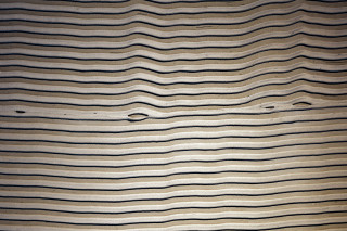
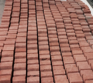
details: various projects worldwide
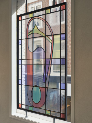
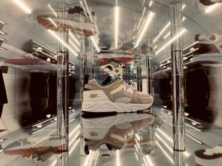
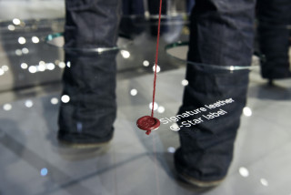
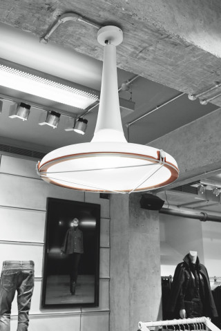
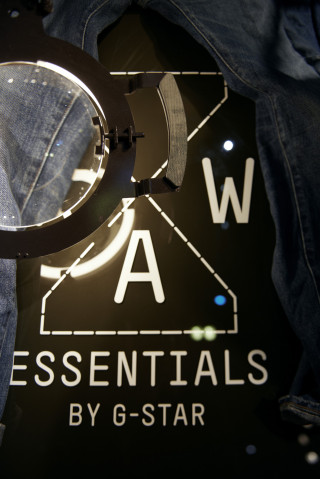

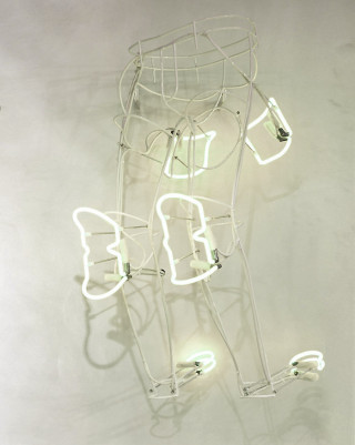

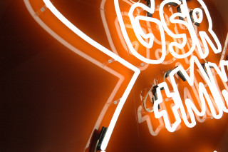
details: various projects worldwide
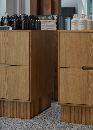
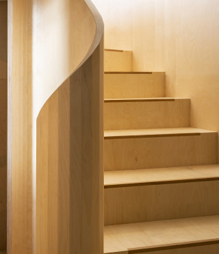
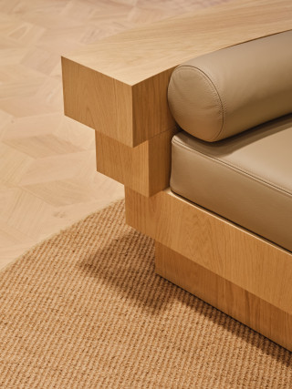
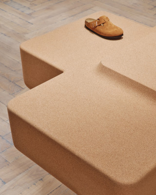
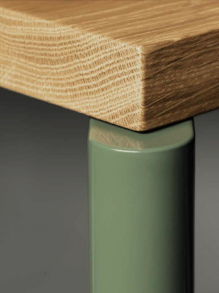
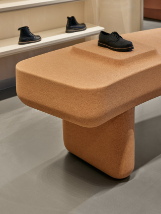

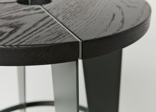
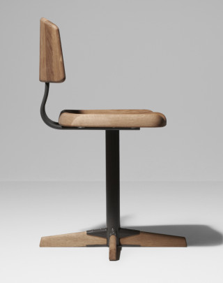
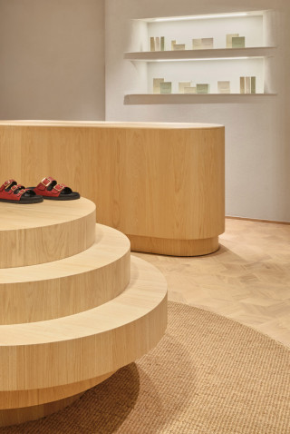
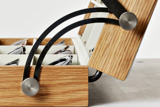

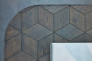
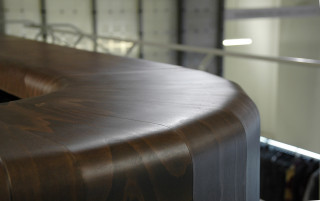
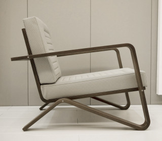
details: various projects worldwide

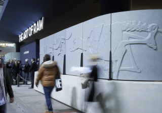
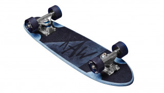
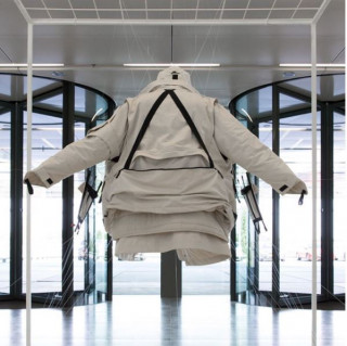
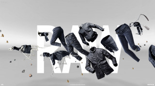

details: various projects worldwide
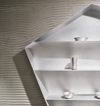
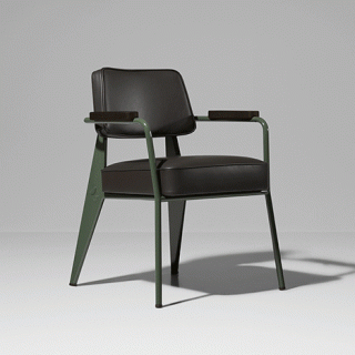

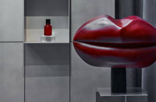
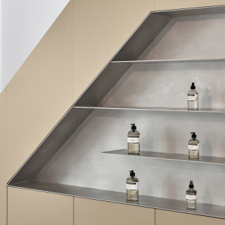


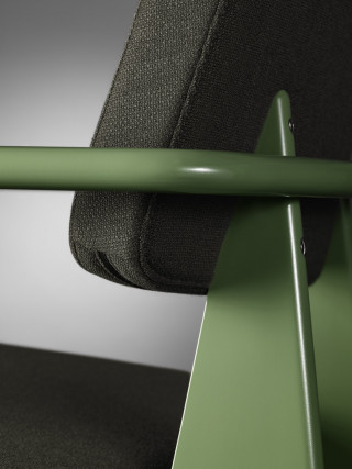
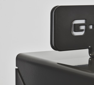
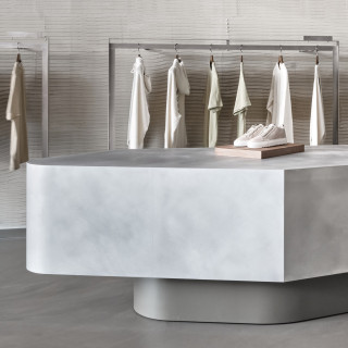
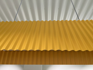
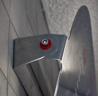

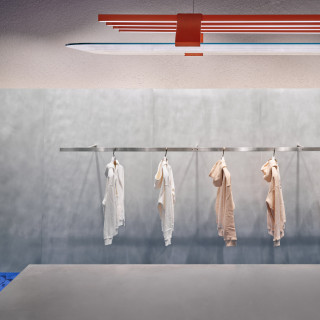
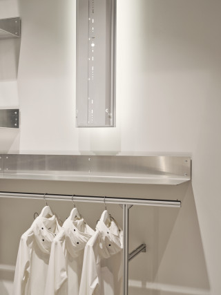
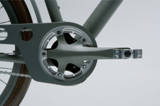
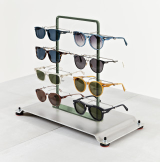
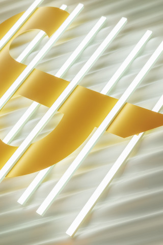
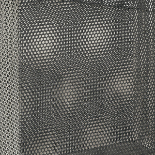
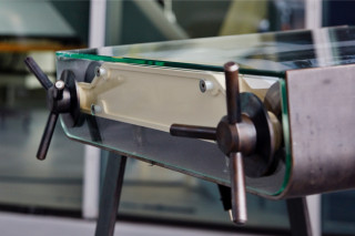
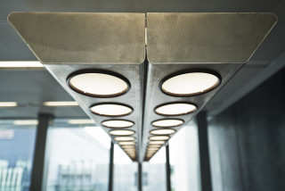
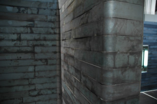
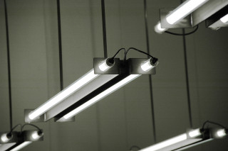
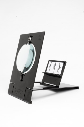
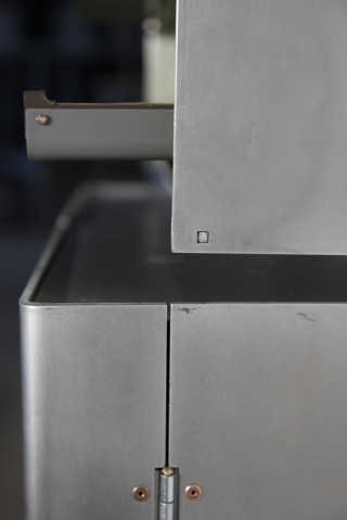
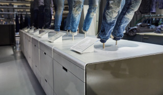

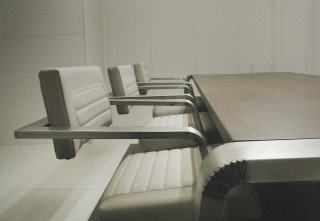
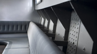
details: various projects worldwide
The Olaf Hussein team comprises a group of urban, diverse and friendly people: passionate about streetwear, but valuing genuine connections over bland coolness. The brands latest monobrand concept location is celebration of relationships, both human and environmental, captured in a modular, friendly minimalist aesthetic.
The store is located in two adjacent ground floor spaces of separate historic buildings that have been connected through a small passage. Over time, many alterations have resulted in an odd eight columns scattered throughout the 150m2 space.
The spatial concept embodies a gallery-like experience featuring a continuous horseshoe wall connecting the two spaces. We placed clothing on the inside and outside of the horseshoe and in three places the wall is punctured by two displays or vitrines, and the third puncture connects the horseshoe with the courtyard so natural light comes in from the back. The courtyard is another really nice feature of this space because it helped create a very logical area for fitting rooms – accessible yet private and there’s beautiful light coming in from the courtyard. The blue showpiece at the end of the store is both a window display and a store-facing display and seating element. Each item in the space has been made with a curve to match the radius of the horseshoe. The u-turn shaped trajectory cleverly navigates visitors past the mirror-clad columns.
The floor has a brown tone and the cardboard main wall is grey, in order to create a neutral background for the clothing. The economic, flexible and sustainable qualities of the cardboard tubes, combined with the tactile appeal of their round and soft textures, fit well with the ‘friendly minimalist’ ethos that defines the brand.
The sustainability strategy for the interior is twofold. Firstly, cardboard is always sourced locally and easily recycled into new cardboard. Consequently, the environmental impact of cardboard is extremely low and it’s truly circular. Secondly, the other fixtures were produced in untreated, low-grade stainless steel. Although the environmental impact during production is high, it’s easy to recycle – not downcycle - and we avoided coatings, paint or other finishes that could contribute to hazardous waste.
photography: Maarten Willemstein